Showing posts with label Timeless Textures. Show all posts

Friday, 13 October 2017

Falling Flowers Sympathy Card

This card is entered into the Crazy Crafters Team Highlights.  Click here to see the full line up and vote for your favourites.

For quite some time I've been admiring the graceful curves and pretty flowers in the Falling Flowers stamp set ... and finally treated myself!  Fortunately, I don't have need of a sympathy card at the moment - which I find is the best time to make one.
#cardmaking, #stampinup, #watercolourbackground, sympathy card, Falling Flowers, Watercolour background, #thecraftythinker, Stampin' Up Australia Demonstrator, Stephanie Fischer, Sydney NSW
Falling Flowers images with a watercoloured background

Planning to use a watery technique, I started out with a piece of Shimmery White cardstock and stamped the flower with Basic Black Archival ink.  I then masked the flower and added the gorgeous flourish.

Once the black ink was completely dry (I admit that I was impatient and used the heat tool!) I made the entire piece of cardstock really wet.  I use a good quality mop brush for this purpose.

Using the same mop brush, I picked up some Dapper Denim ink and added it to the wet cardstock.  I mainly concentrated on the area to the left of the image but I did bring a little across to the other side of the card too.  I then repeated the process with Crumb Cake ink, concentrating on the right side of the card.  I like to use drops of ink from the reinker but you could also use ink from the pad - probably best to tap a good amount of ink onto a non-porous surface that can act as a palette.

Once I was happy with the coverage, and while the card was still fairly damp, I used the wood grain image in the Timeless Textures stamp set to add more of the inks.  One area had was not quite damp enough for the stamped ink to bleed, so I ran my damp mop brush over it again.

When
the card was completely dry, I added colour to the stamped image using Crumb Cake and Dapper Denim inks with just a hint of Whisper White Craft Ink for highlights.  I also added some loose hints of shadows.

The greeting is from the Better Together stamp set and the label layers are Crumb Cake, Dapper Denim and Basic Black.  All the ends are trimmed with a Lots of Labels die.  Visit here for an idea of how I achieved that.  The difference is that the labels on today's card were narrower than the die I used for the ends.

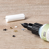
The base card is Crumb Cake and the mat is Basic Black.  To give a lift to the sombre colour scheme, I added some of the gorgeous copper sequins in the Metallics Sequin Assortment.

Thank you for visiting.
'Til next time!
Stephanie

Product List - To visit my online store, click on a product image below (Australian Residents only)

Sunday, 26 March 2017

Kinda Eclectic Textures

To be perfectly honest - this didn't turn out quite as I'd envisaged!  But that's the nature of crafting -  I'm not unhappy with the result, even if it wasn't the one I was expecting!
Monochrome, Emboss Resist, Kinda Eclectic, Timeless Textures, #thecraftythinker, Stampin Up Australia Demonstrator, Stephanie Fischer, Sydney NSW
Using Emboss Resist and layers of ink to create a monochromatic card

I was experimenting with inky layers and the emboss resist technique.

Starting with a piece of Shimmery White cardstock (because it's able to withstand the abuse I was planning to throw at it!), my first step was to stamp the textured ribbon image with Versamark and clear heat emboss it.

Next I sponged the entire piece with Pool Party ink and stamped the splodges with Pool Party ink.

I then very thoroughly wiped the surface with my Embossing Buddy before stamping the butterfly with Versamark and clear heat embossing it.

Next, I inked the leaves with Versamark and then immediately with Emerald Envy and stamped the image.  I quickly added clear embossing powder and heat set it.

I used a clean sponge dauber to add more Versamark to the leaves and sprinkled on the clear embossing powder.  Once I'd tapped off the excess powder, I used a small, clean paint brush to clean away any excess powder from around the leaves before heat setting.

After another wipe with the Embossing Buddy, I stamped the ribbon image again with Versamark and heat set it.

I did some more sponging with Pool Party ink and then Bermuda Bay, concentrating on the edges and pulling it in towards the centre.  Then I stamped the edges with Emerald Envy ink and sponged the edges with Emerald Envy ink, blending it out but covering less area than the previous inks.

I made the card with an A5 piece of Emerald Envy cardstock and added a layer of Pool Party before the decorative layer.

It wasn't my intention to add any more layers or labels but, being honest again, when I stamped the greeting straight onto the card front it had no impact.  So I stamped the greeting (from Watercolour Wishes) onto a label cut with one of the Lots of Labels dies (I adjusted the size to fit the greeting) and sponged the edges with Bermuda Bay and then a touch of Emerald Envy.  Since I now had an extra layer, I made the most of it by popping the label up on Stampin' Dimensionals.

Monochrome, Emboss Resist, Kinda Eclectic, Timeless Textures, #thecraftythinker, Stampin Up Australia Demonstrator, Stephanie Fischer, Sydney NSW
I used Pool Party and Emerald Envy ink to stamp the inside of the card.

Thank you for visiting.
'Til next time!
Stephanie

Product List - To visit my online store, click on a product image below (Australian Residents only)

Friday, 22 July 2016

Jar of Seaside Joy

This card is entered into this week's Crazy Crafters' Team Projects Highlights.  Click here to see all the other great projects and vote for your favourites.

A few weeks ago I shared with everyone a card I had made for my husband that featured a porthole with a fish swimming in a shower gel sea!  You can see that card here.

At the time I mentioned that I had yet to perfect the process because the fish was deteriorating in the gel after a few days, despite the layers of clear heat embossing.

A reader by the name of Rachel came up with the genius suggestion of laminating the fish which I thought was brilliant and couldn't wait to try it!  Well, it works!!!

Stampin Up, #thecraftythinker, Jar of Love, Timeless Textures, Seaside Shore, fish in Gel Card, Stampin Up Australia Demonstrator
The laminated fish stays pristine inside the gel!

I made this fish at the same time as the one in the previous card so it seemed an ideal test!  I laminated it and then carefully cut around it, being sure to leave sufficient margin to retain the integrity of the lamination.  It has now been in the gel for several days and still looks perfect!  The poor fish is a bit cramped in that jar but he's coping!

So .... here's a HUGE shout out of gratitude to Rachel for solving my problem!  You are amazing and wherever you are, take a bow!

I'm not entirely happy with the card itself - it started out simply as a test prototype and sort of grew from there and I think that shows - it's not the most cohesive card I've ever made - but I'm so happy with the success of the process that I don't mind sharing it!

My brother-in-law liked the card I made for my husband and said he'd like something similar (his nickname is The Fish), so I tried to keep a masculine look.  The front of the card is stamped in Bermuda Bay and Dapper Denim (stamped off) using the Touches of Texture stamp set.  I added a strip of Bermuda Bay cardstock and some Dapper Denim Enamel Shapes.  I stamped the greeting from Birthday Blooms onto Pool Party cardstock with Dapper Denim ink, cut it out with one of the dies from Lots of Labels and then cut a mat for it from Dapper Denim cardstock.

I made a narrow banner from Pool Party cardstock for the top of the jar panel and then adhered the greeting label with dimensionals.

Stampin Up, #thecraftythinker, Jar of Love, Timeless Textures, Seaside Shore, fish in Gel Card, Stampin Up Australia Demonstrator
I kept things really simple inside the card to make the fish the star of the show.

I kept the inside of the card quite plain, because I didn't want to detract from the fish.

Thank you for visiting
'Til next time
Stephanie


Product List


Sunday, 8 May 2016

GDP034 - Teenage Boy birthday card

Teneale Williams' sketch for GDP034 really appealed to me, although it's not my usual style.  
Click on the image to link to the Global Design Project
So it was in my mind while I was making this card for my Great Nephew's (yes - I have many!) 14th birthday card.


Stampin Up, #GDP034, teenage boy birthday card, Timeless Textures, Time of Year
Those sequins are hard to photograph - they're actually all the same shade of blue!

I spritzed a piece of Shimmery White cardstock with water and then stamped twice (once each way) with the woodgrain stamp in the Timeless Textures set and a mix of Crumb Cake and Soft Sky inks.  I let it run for a while before I dried it - yes, I was impatient!

I stamped the numbers in Whisper White ink onto Dapper Denim cardstock - it's one of the new In colours for 2016-2018 and just screams "teenage boy" to me!  When the ink was dry I gave the numbers a coat of clear Wink of Stella that, unfortunately, doesn't show in the photograph.  I used the matching Large Numbers framelits to cut out the numbers.

I stamped the "th" from Number of Years and the birthday banner in Dapper Denim ink.  The banner is from the new Hostess stamp set Time of Year which has some great greetings and banners for most occasions.  

I popped the numbers up on foam - a task that will be much easier with the arrival of  the new foam adhesive strips!

I glued the stamped panel to a Dapper Denim card and then stuck on some sequins from the Brights Sequins Assortment.

Thanks for your visit.
'Til next time.

Stephanie

Product List - to shop in my online store, click on one of the product images (Australian Residents only)